Filtering is used to limit the objects in a data set based on one or more parameters. It is commonly used in tandem with a Table or Advanced Table, but the core concepts have a wide range of relevant use cases depending on the type of data set and the context within the application.
Structure
A filtering pattern consists of a number of Helios components that work together functionally and enforce a consistent layout. These elements are variable depending on the data set's content and the context within the application and can be combined in different ways to achieve an experience that benefits the end user.
Data set
A data set is a broad term for an array of items, objects, or related information presented as separate but related records. A data set is commonly represented via a Table or Advanced Table but may be expressed in other formats depending on the type of information.
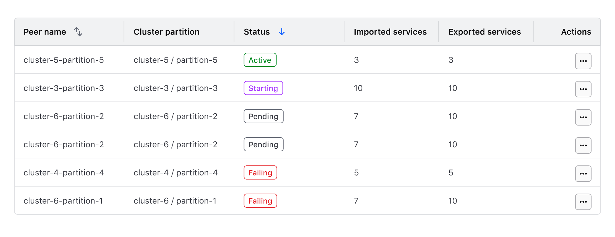
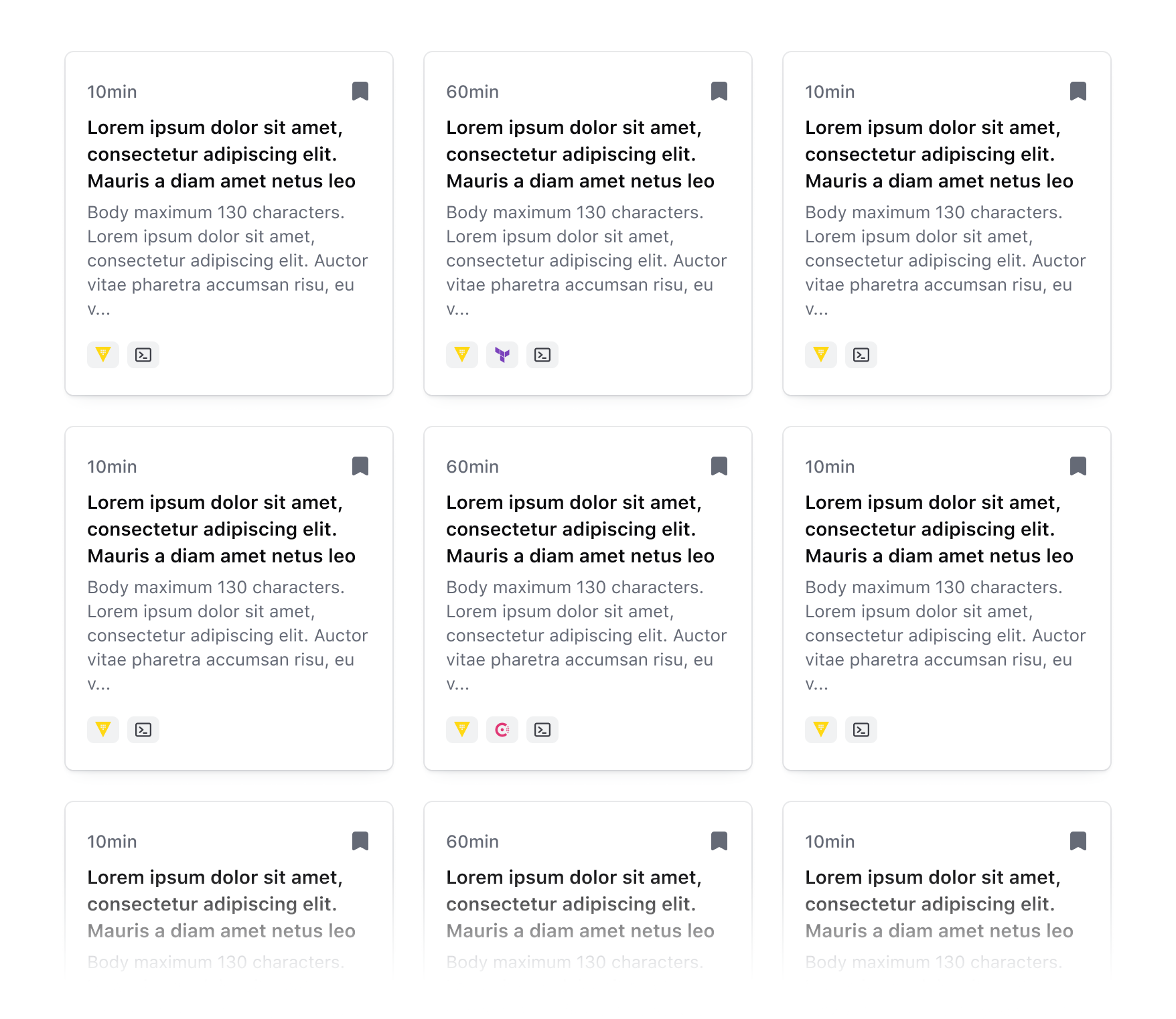
Filters
Filters are responsible for the functional aspect of limiting a data set and for displaying the parameters which a user can filter upon. Filter positioning is largely dependent on the complexity of the data set and the scope to which the filters are being applied. For example, are the filters applied at the page level or only to the data set they are paired with?
Filters often consist of numerous parameters that mirror the columns of a table or parameters contained within the data set. For more details on mirroring filters and parameters within a data set, refer to the filtering core concepts.
Filter bar
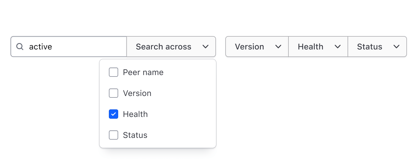
Organizing filters in a filter bar is a common positioning method and consists of one or more dropdowns, buttons, or input components that are used to select values from a set of parameters. A Segmented Group can be used within a filter bar to group similar parameters and support complex filtering.
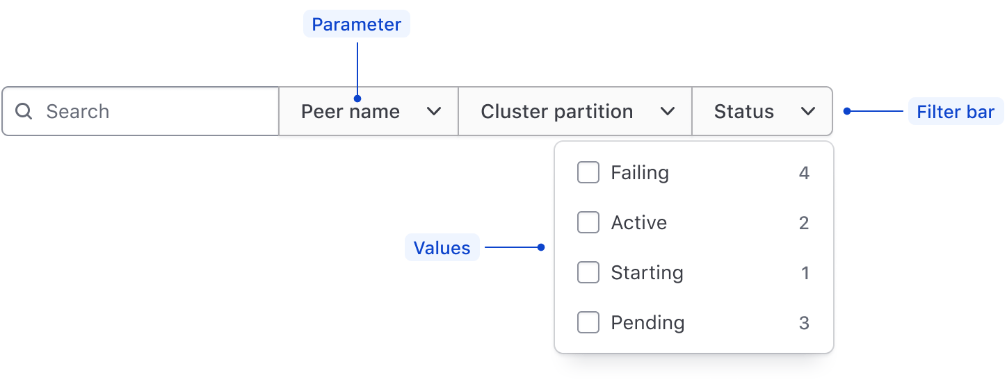
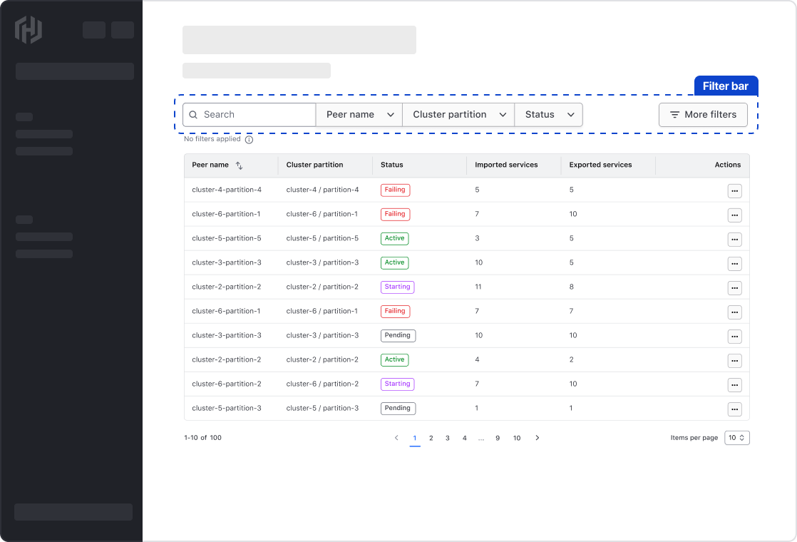
Depending on the filter type and how they are related, multiple Segmented Groups can be used to group similar filters together. For example; a Search Input grouped with a Dropdown to limit the filter parameters that are included in the search.
Sidebar
If space permits, filters can be positioned vertically in a sidebar at the page level or in line with the data set.
Page-level sidebar
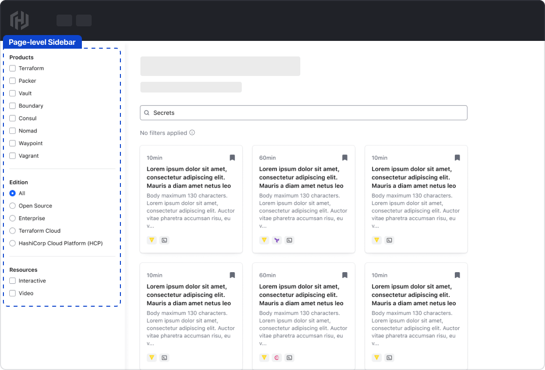
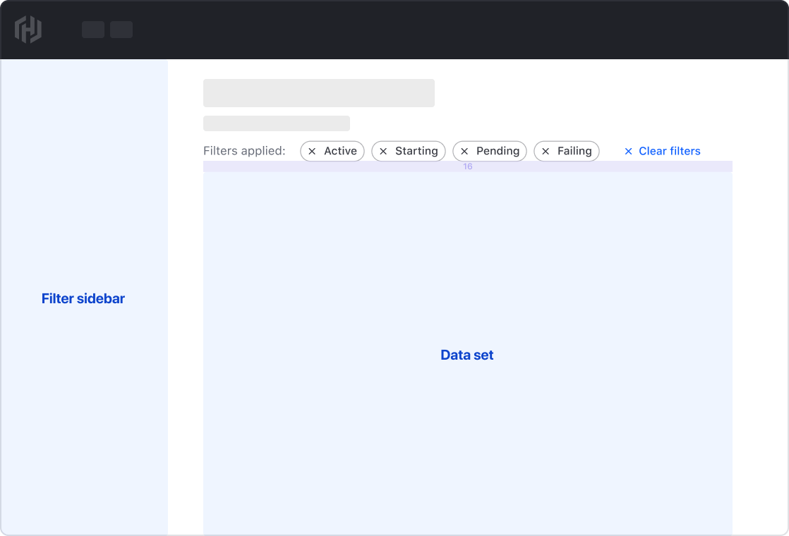
Page-level sidebars can be used to filter a data set presented in a non-tabular fashion and if filtering the content of the entire page is required. A sidebar should be oriented on the left (start) side of the viewport.
In-line sidebar
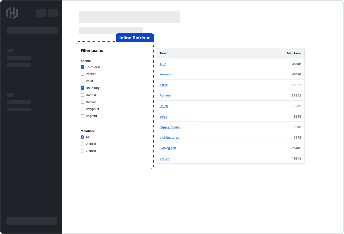
In-line sidebars can be used when the number of filterable parameters is minimal and if space permits.
Applied filters
Display the applied filters and provide the user with a method to clear all filters at once. Applied filters should be represented using a Tag component, which allows for the individual dismissal of a filter value.

Positioning with filter bars
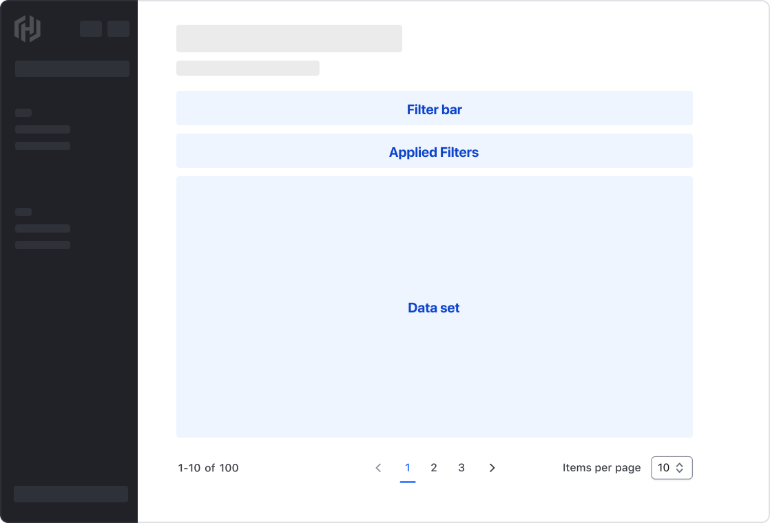
Applied filters should be positioned between the data set and the filter bar with a 16px gap between elements.
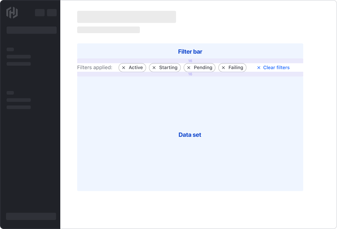
If the filters are positioned in a page-level sidebar, the applied filters should be positioned directly above the dataset with a 16px gap.
Global filter functions
Depending on the fetching method and complexity of the data set, global filter functions can be used to expose methods that effect the entire data set. Global functions should be differentiated from the primary filters and aligned to the end of the data set. Examples include:
- Manually refreshing the data set.
- Triggering a Flyout with more complex filters.


In the case a multiple filter functions, use the Segmented Group. If only a single function is necessary, use the secondary Button.
Pagination
Use pagination to break down the filtered data set into pages. For more details, refer to the Pagination guidelines.
Filtering methods
Depending on the fetching strategy, size, and rendering method of the data set, how filters are applied and the impact on the user experience varies.
Live filtering
Live filtering refers to updating the records within a data set immediately after a user makes a selection. This method results in a responsive user experience, but may not be possible with large data sets or complex filtering methods.
Per-filter
Applying filters one at a time lets the user to "finalize" their decision before applying, avoiding the distraction of the data set constantly updating in the background. This method is useful when the user may want to select multiple values in a single dropdown, but requires an extra step to apply the filters.
Batch filtering
Batch filtering supports the user making multiple selections across different parameters and only updating the results of the data set when the user interacts with a global "apply" function. This method is useful when the data set is very large or when the filter parameters are complex.
Displaying selected filters
Communicate that values corresponding with a filter parameter have been applied within the Dropdown by adding a BadgeCount within the filter.
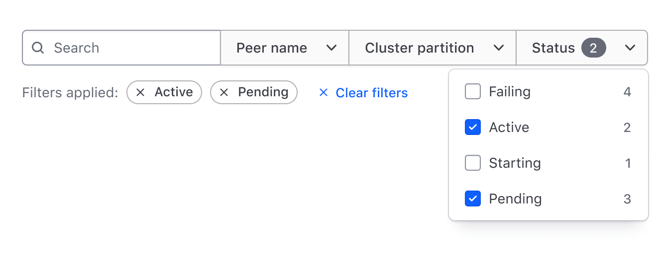
This, when combined with the applied filters provides a detailed snapshot of what specific filter values are applied to the data set and the relevant parameters that they correspond with.

Empty state
Empty state within a filter pattern is expressed in two different ways:
- Applied filters have resulted in no records being returned in the data set.
- No filters have been applied resulting in no tags in the applied filters area.
Within a data set
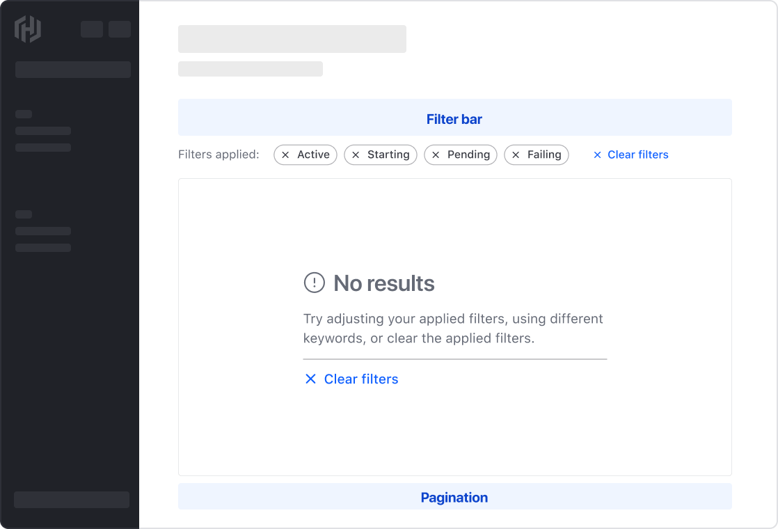
Depending on the applied filters, there may not be any records returned from a data set that match parameters and values selected. In this case, communicate the empty state to the user and highlight instructions to adjust the filters or provide a method to clear all filters.
Use the Helios Application State component to communicate the lack of results and steps the user can take to remedy the situation.
Within applied filters
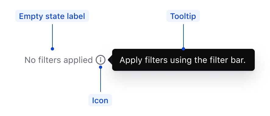
If no filters have been applied, use a Tooltip coupled with the applied filters label to guide the user to the filter functions. Not only does this provide context and direct the user to the filters, but it prevents unnecessary layout shift upon applying filters.
Avoiding an empty state
As filtering is reductive in nature and driven by a user action, it’s not always possible to avoid an empty state.
If technically feasible, use the count property within the Dropdown ListItem to call attention to filters that will return zero results.
In this example, "Status > Pending" does not return any results.

Reverting filters
If applying filters to a data set yields no results, offer users an option to clear all or specific filters.
This can be done by adding a "Clear all" action to the Application State or by including dismissible Tags for each applied filter.
Filter overflow
Depending on the data complexity and expected user interactions, it may be necessary to consider how filtering elements might overflow into other areas of the UI.
- What happens when there are many filters applied to a data set?
- Is there a specific hierarchy or importance in the filter parameters that might determine how they are ordered or displayed to the user?
- What happens when there are many parameters that can be filtered upon?
These scenarios can clutter the UI, detracting from a table's primary purpose: organizing data categorically, relationally, and structurally.
Applied filters overflow
Basic example
For simple data sets or Tables with a few columns, managing filter overflow may not be necessary. As more filters are applied, wrapping to new lines follows a common browser reflow pattern. This approach is predictable: the user's explicit filter action is directly reflected in the UI, providing positive reinforcement and allowing easy scanning of applied filters.

Intermediate example
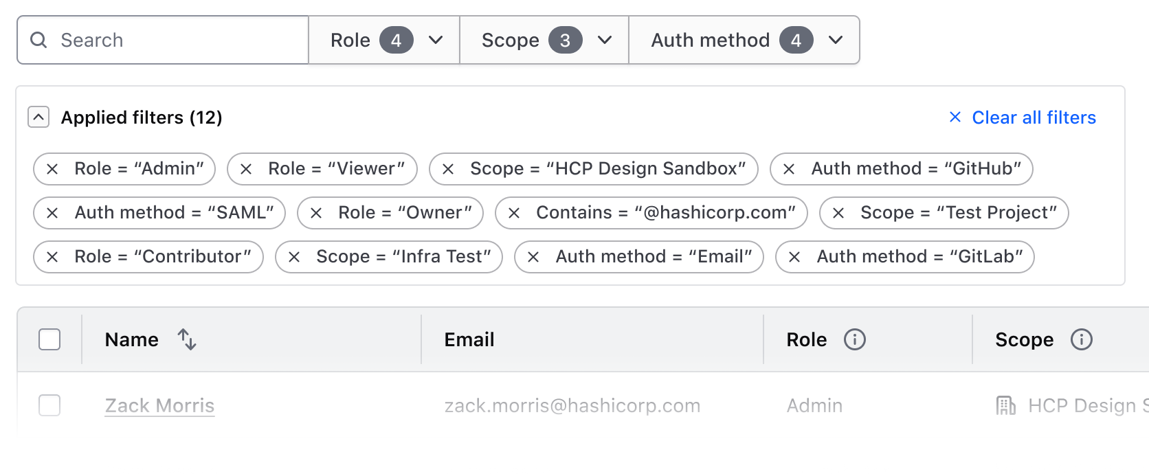
Filtering a complex data set may result in numerous filters overwhelming the UI and detracting from the Table's content.
In this scenario, consider moving the applied filter Tags to a small, card Accordion using the containsInteractive variant. This pattern:
- Accommodates numerous applied filters
- Simplifies the UI, reducing cognitive load
- Supports complex, interactive content within the Accordion (e.g., a "Clear all filters" function)
Filter parameters overflow
In complex data sets with numerous filterable parameters, considering establishing a hierarchy of filters by:
- Prioritizing crucial filters associate them directly with the Table and data set
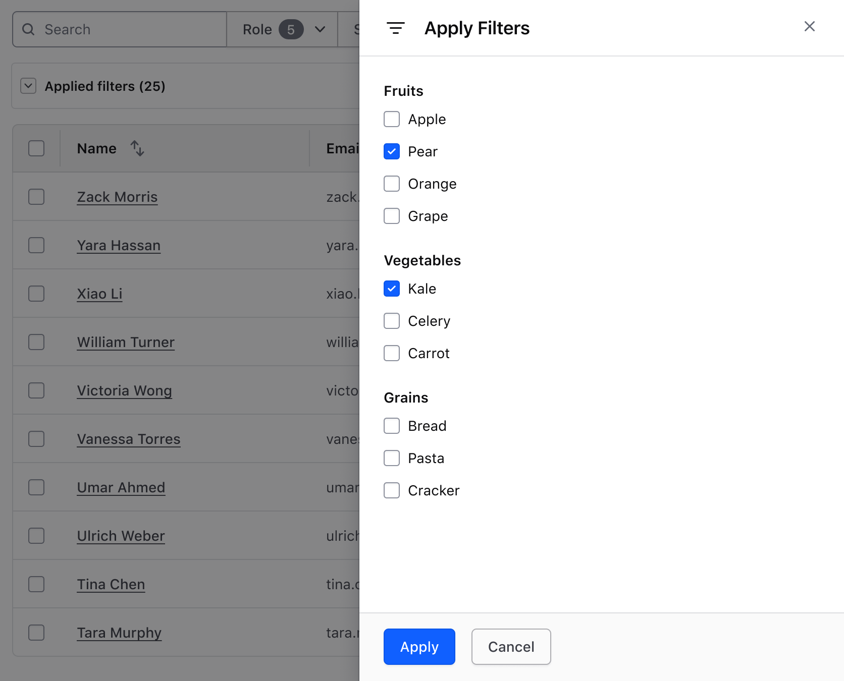
- Moving less important filter parameters to a Flyout, using Checkbox groups for each parameter and its values.
This approach offers a scalable solution for highly complex data sets while communicating a natural hierarchy of filter importance.

Accordions within a Flyout
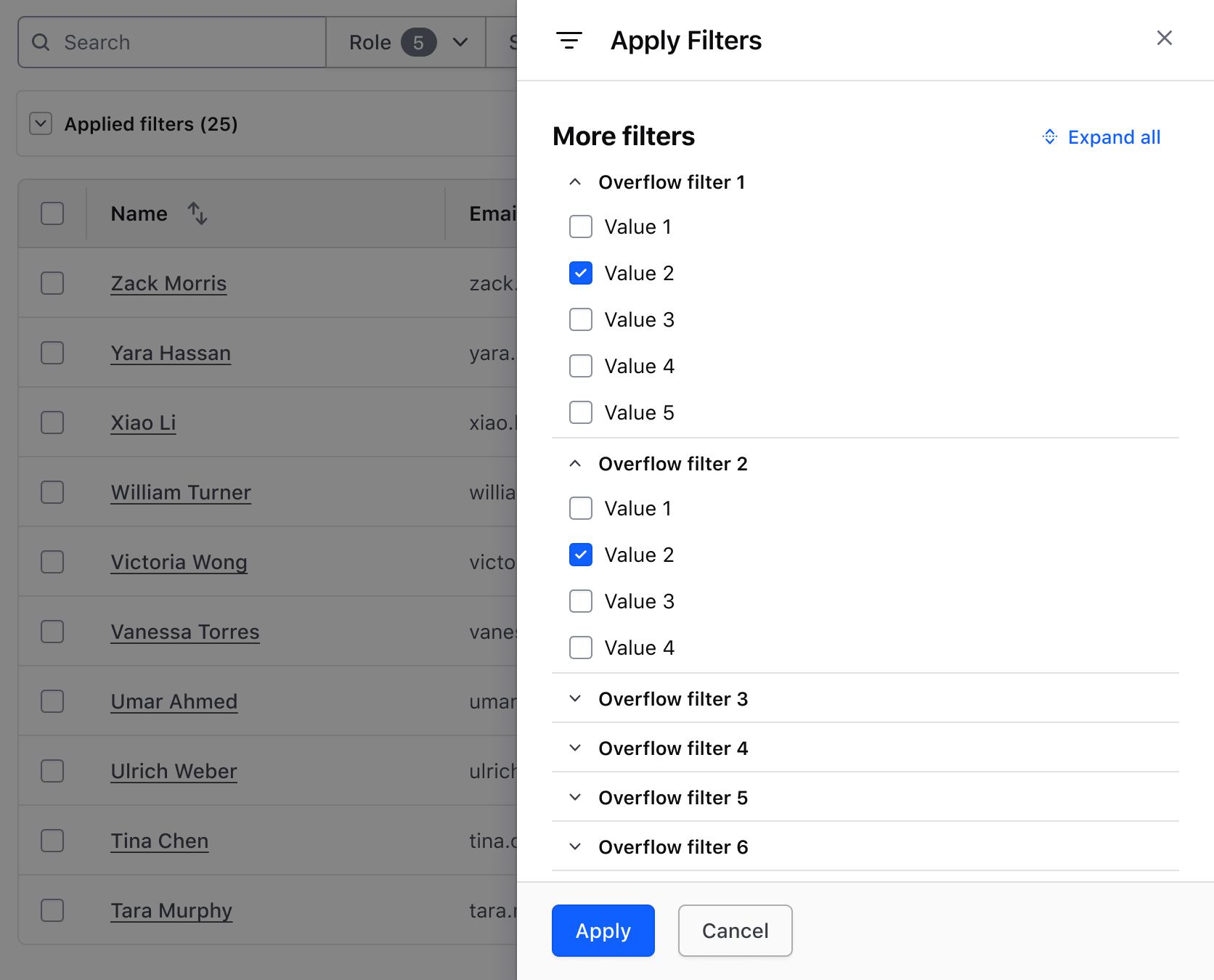
For excessive filter parameters causing a long scroll in the Flyout, consider placing each parameter in a flush, small Accordion, and optionally, add an "Expand/Collapse All" Button. This approach gives users more control over the UI and allows for visual comparison between filter parameters.
Putting it all together
A holistic approach to supporting overflow in a filter pattern will consist of:
- A filter bar with high-impact parameters, plus a secondary Button that triggers a Flyout for less common filters.
- An Accordion displaying all applied filters with a bulk dismiss option.
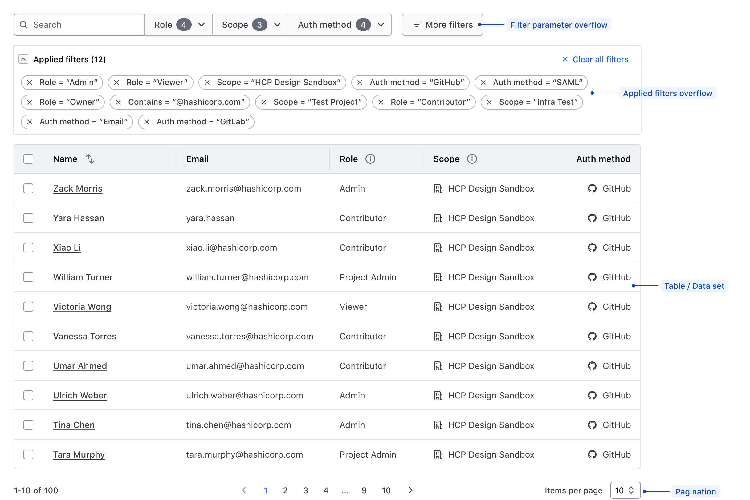
This contextual example demonstrates a comprehensive yet simple method of composing multiple Helios components to support these overflow concepts. It is interactive but doesn't include any functional logic.
<div class="doc-filter-patterns-wrapper">

  <div class="doc-filter-patterns-filter-bar">

    <Hds::SegmentedGroup as |SG|>
      {{#each this.model.demoFilters as |filter|}}
        <SG.Dropdown @listPosition="bottom-left" as |D|>
          <D.ToggleButton @color="secondary" @text={{filter.name}} />
          {{#each filter.options as |option|}}
            <D.Checkbox>{{option.name}}</D.Checkbox>
          {{/each}}
        </SG.Dropdown>
      {{/each}}
    </Hds::SegmentedGroup>
    <Hds::Button
      @text="More filters"
      @icon="filter"
      @iconPosition="leading"
      @color="secondary"
      {{on "click" (fn this.activateFlyout "filterFlyoutActive")}}
    />
  </div>

  {{#if this.filterFlyoutActive}}
    <Hds::Flyout
      id="filter-flyout"
      @onClose={{fn this.deactivateFlyout "filterFlyoutActive"}}
      as |F|
    >
      <F.Header @icon="filter">More filters</F.Header>
      <F.Body>
        <div class="doc-filter-patterns-flyout-label">
          <Hds::Text::Display
            @size="300"
            @color="strong"
          >Diet</Hds::Text::Display>
          <Hds::Button
            @text={{if (eq this.state "open") "Collapse all" "Expand all"}}
            @icon={{if (eq this.state "open") "unfold-close" "unfold-open"}}
            @iconPosition="leading"
            @size="small"
            @color="tertiary"
            {{on "click" this.toggleState}}
          />
        </div>
        <Hds::Accordion
          @forceState={{this.state}}
          @type="flush"
          @size="small"
          as |A|
        >
          {{#each this.model.demoOverflowFilters as |overflowFilter|}}
            <A.Item>
              <:toggle>{{overflowFilter.label}}</:toggle>
              <:content>
                <Hds::Form::Checkbox::Group
                  @name={{overflowFilter.label}} as |G|
                >
                  {{#each overflowFilter.values as |value|}}
                    <G.CheckboxField as |F|>
                      <F.Label>{{value.name}}</F.Label>
                    </G.CheckboxField>
                  {{/each}}
                </Hds::Form::Checkbox::Group>
              </:content>
            </A.Item>
          {{/each}}
        </Hds::Accordion>
      </F.Body>
      <F.Footer>
        <Hds::ButtonSet>
          <Hds::Button
            @color="primary"
            @text="Apply filters"
            {{on "click" (fn this.deactivateFlyout "filterFlyoutActive")}}
          />
          <Hds::Button
            @text="Cancel"
            @color="secondary"
            {{on "click" (fn this.deactivateFlyout "filterFlyoutActive")}}
          />
        </Hds::ButtonSet>
      </F.Footer>
    </Hds::Flyout>
  {{/if}}

  <Hds::Accordion @size="small" @type="card" as |A|>
    <A.Item @containsInteractive={{true}}>
      <:toggle>
        <div class="doc-filter-patterns-accordion-toggle">
          <Hds::Text::Body
            @color="strong"
            @size="200"
            @weight="semibold"
          >Applied filters (25)</Hds::Text::Body>
          <Hds::Button
            @size="small"
            @color="tertiary"
            @icon="x"
            @iconPosition="leading"
            @text="Clear all filters"
            {{on "click" this.clearAllFilters}}
          />
        </div>
      </:toggle>
      <:content>
        <div class="doc-filter-patterns-applied-filters">
          {{#each this.model.demoAppliedFilters as |appliedFilter|}}
            <Hds::Tag
              @text={{appliedFilter}}
              @onDismiss={{this.filterDismissFunction}}
            />
          {{/each}}
        </div>
      </:content>
    </A.Item>
  </Hds::Accordion>

</div>
More complex filtering scenarios
These guidelines cover common methods for handling overflow in filter patterns, but exclude more complex scenarios such as:
- Filtering based on complex queries
- Conditional statement-dependent filtering
- Saving and recalling applied filters
- Product and business logic-specific use cases.
For projects exceeding the complexity outlined here, please contact the HDS team for support and recommendations.
Pattern types
Orient filter patterns in either a horizontal filter bar, or a vertical filter sidebar. The core anatomy of a filter pattern remains largely the same regardless of the orientation, layout, or positioning method.
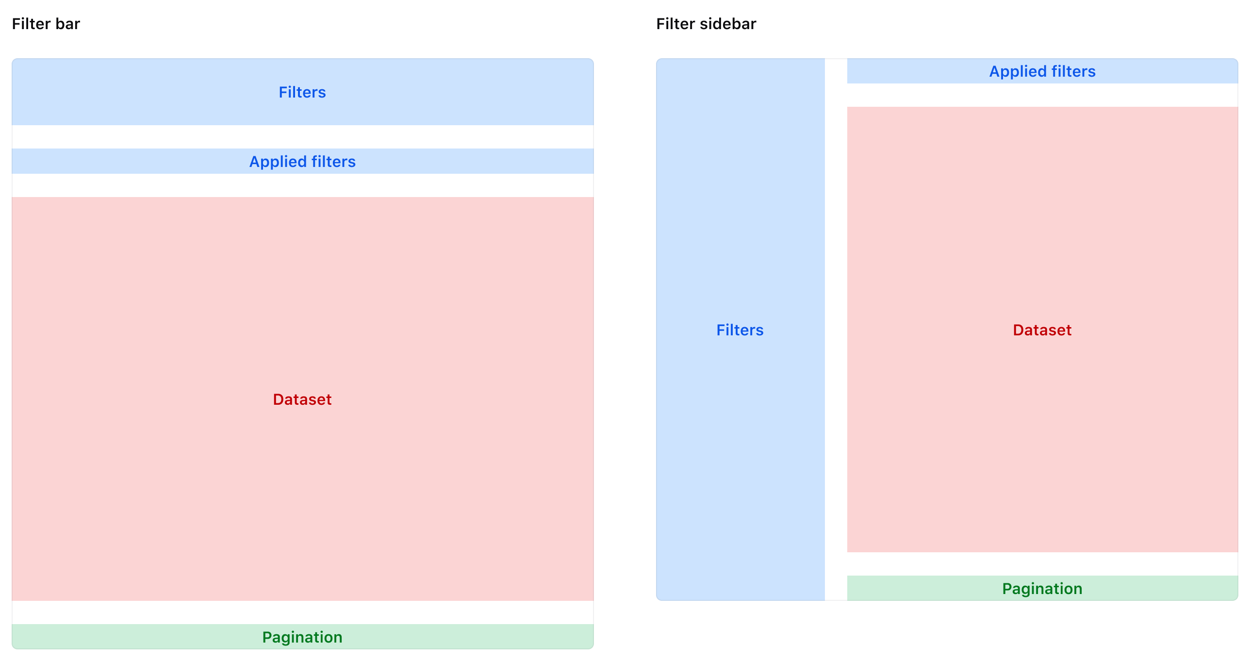
| Element | Usage |
|---|---|
| Filters | Required; can be represented by a filter bar or a filter sidebar. |
| Applied filters | Required |
| Data set | Required |
| Pagination | Optional; recommended for larger data sets. |
Filter bar orientation

The most common method of organizing filters is in a filter bar which orients the filters horizontally on top of the data set. This orientation is flexible and is commonly used in tandem when a data set is presented in a Table or Advanced Table.
Filter sidebar orientation

If the page layout supports it, filters can be organized in a filter sidebar at the left (start) of the viewport. This is common when a data set is presented in a grid or the in a non-tabular format.
Pattern spacing
Vertical spacing
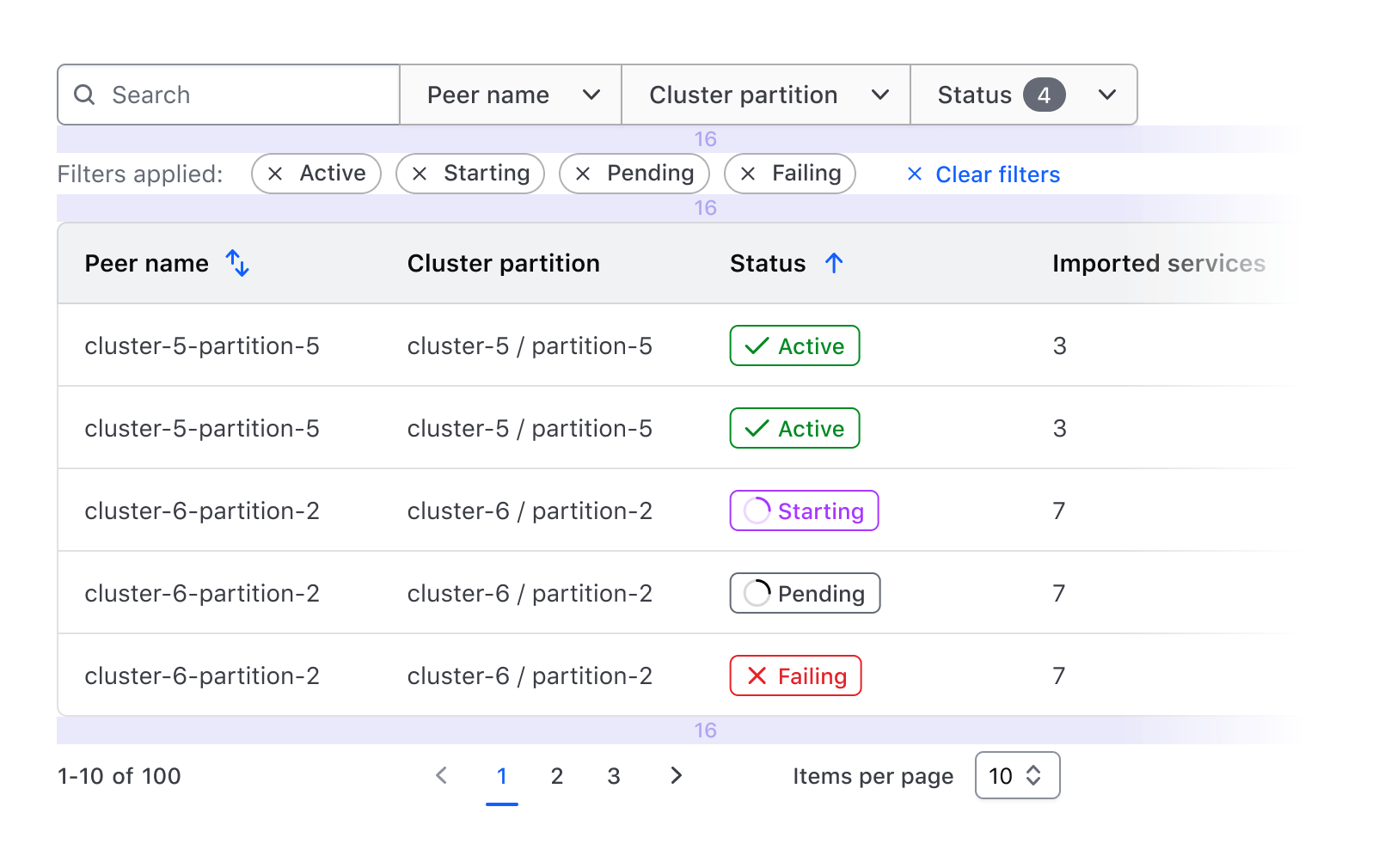
When spacing elements vertically within the pattern, use a 16px gap.
Horizontal spacing
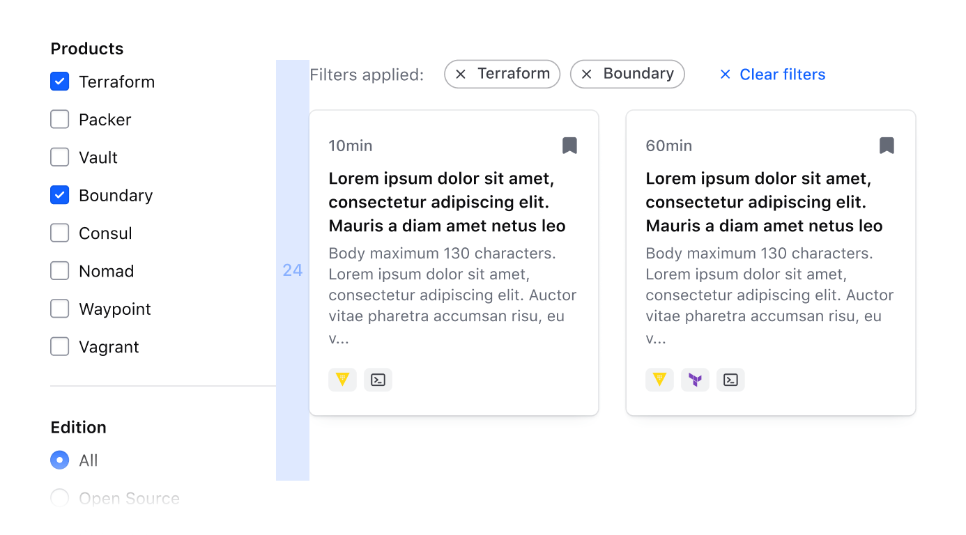
When spacing elements horizontally within the pattern, use a 24px gap.
Filter bar
Filter bar anatomy
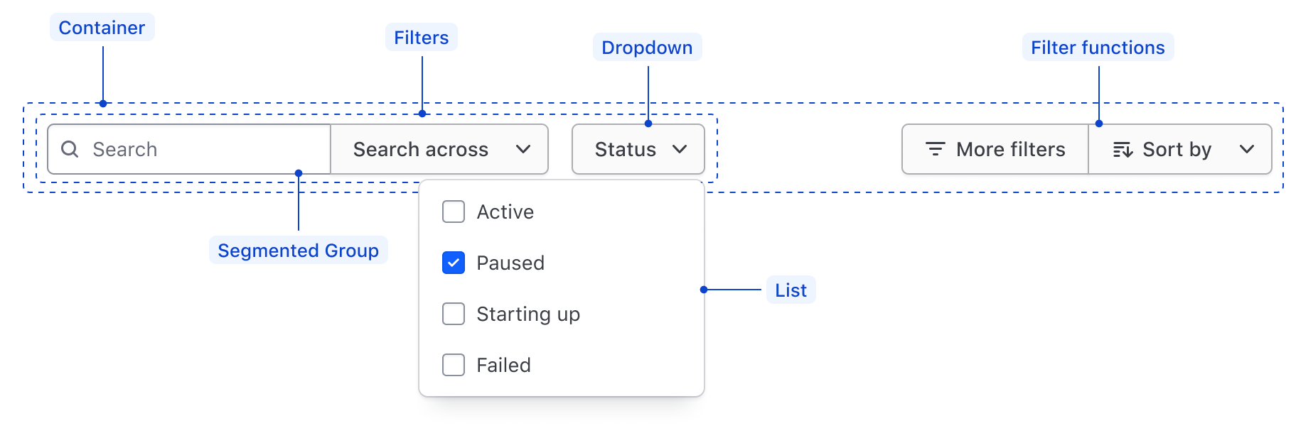
| Element | Usage |
|---|---|
| Container | Required; spans the width of the data set and wraps filter elements. |
| Filters | Required; dictates what parameters are available to filter upon. |
| Segmented Group | Optional, but recommended to group similar or related filters together. In the case of a single filter, use a Dropdown. |
| List | Required; coupled with the Dropdown, displays filter values that correspond with the parameter in the Dropdown Toggle |
| Filter functions | Optional; responsible for performing global functions on the data set. |
Filter bar spacing
Use a 16px gap between each filter element or Segmented Group within the filter bar.

Align filter functions to the end of the container with space between the primary filters and the global functions.

Filter bar within a pattern
Within a filter pattern, stack the filter bar on top of the data set and applied filters with a 16px gap between each element.

Filter sidebar
Filter sidebar anatomy
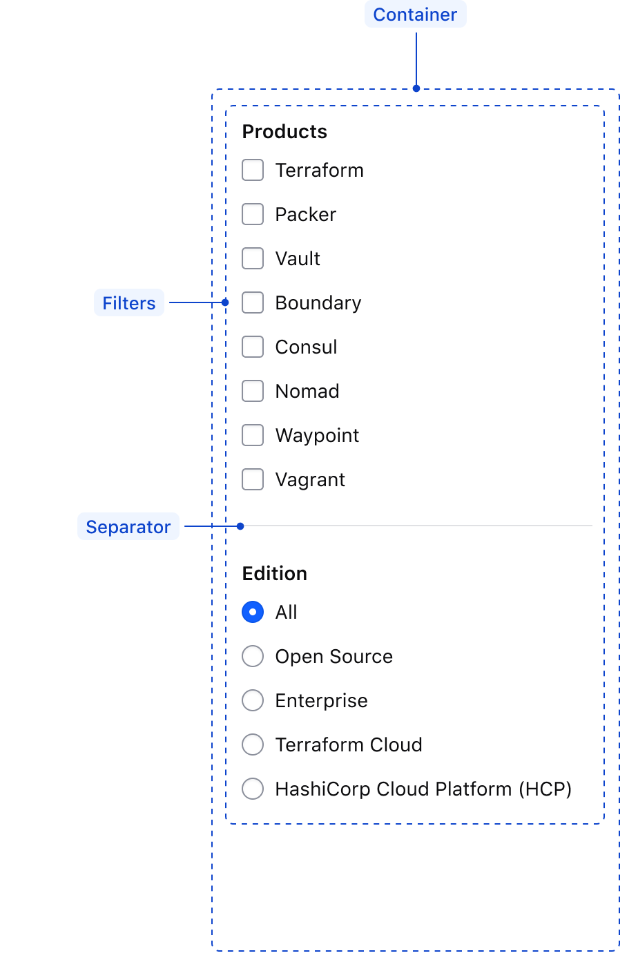
| Element | Usage |
|---|---|
| Container | Required; wraps the filter elements and occupies the height of either the page or the data set depending on the scope of the filters. |
| Filters | Required; dictates what parameters are available to filter upon and the corresponding values. Can be represented by a Checkbox group or Radio group |
| Separator | Required to separate multiple filter parameters within a sidebar. |
Filter sidebar spacing
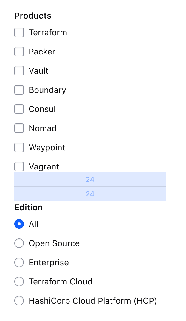
Spacing within a filter sidebar extends the guidelines for spacing within a form pattern. Differentiate groups within a sidebar using a Separator with a vertical gap of 24px on the top and bottom of the Separator.
Filter sidebar within a pattern
Within a filter pattern, the filter sidebar can be positioned one of two ways:
- At the page level, spanning the available height of the page or viewport.
- In-line with the data set if the filter parameters are less complex.
Filter sidebar at the page level
Positioning filters in a sidebar at page level removes them from the normal layout flow. In this case, align the sidebar at the start of the viewport excluding any global navigation elements and use 24px of internal padding within the sidebar.
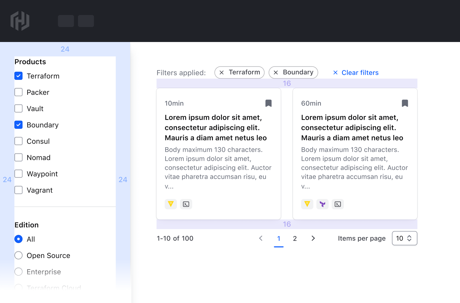
Filter sidebar in-line with a data set
Positioning a filter sidebar in-line with the data set should only be done in cases where the number of filter parameters is small or complexity is low. Use a 24px gap between the sidebar and the data set in this scenario.

Applied filters

| Element | Usage |
|---|---|
| Container | Required; wraps the label and applied filters to enforce consistent spacing. |
| Label | Required; communicates whether filters have been applied or not. |
| Tag list | Required; consists of one or more dismissible Tags that communicate the specific filter value. |
| Bulk clear | Required; clear all applied filters with a single bulk action. Use a small tertiary Button with an icon. |
Applied filters Spacing
- Use a
16pxgap between elements in the applied filters. - Use a
8pxgap between tags in the tag list. Refer to the Tag spacing guidelines for more details.
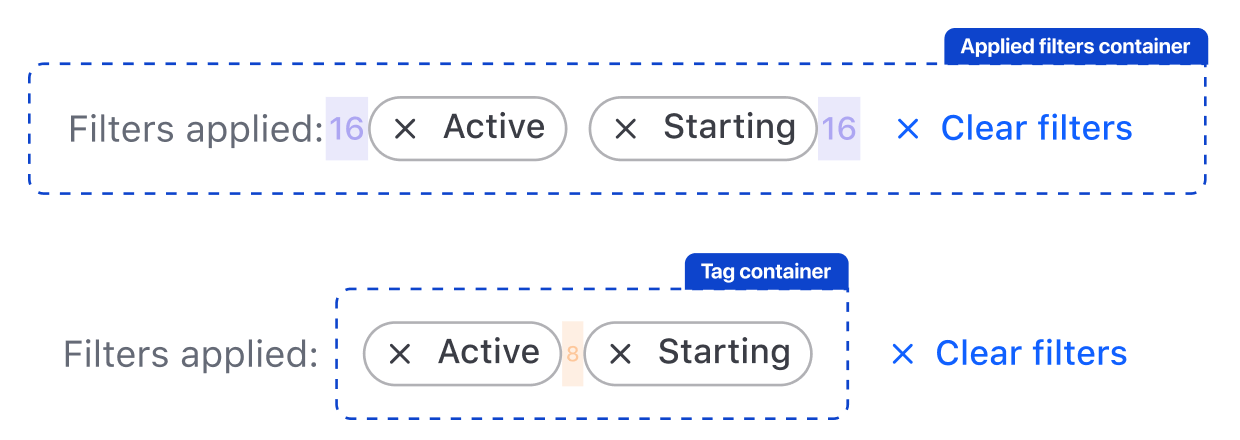
If the number of tags spans more than one line, use a 12px gap between lines.

Applied filters within a pattern
Within a filter pattern, position the applied filters above the data set with a 16px gap. If paired with a filter bar, the applied filters should sit between the filter bar and the data set.

If not paired with a filter bar, the applied filters should still be positioned above the data set with a 16px gap.
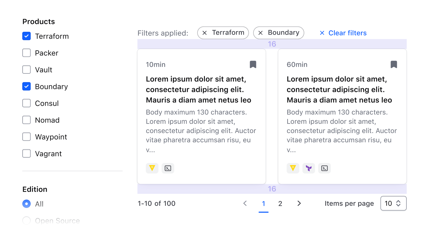
Pagination
Refer to the Pagination guidelines for details around spacing and usage of the component.
Pagination within a pattern
Within a filter pattern, position Pagination at the bottom of the data set using a 16px gap between elements and ensure that the Pagination spans the width of the data set.
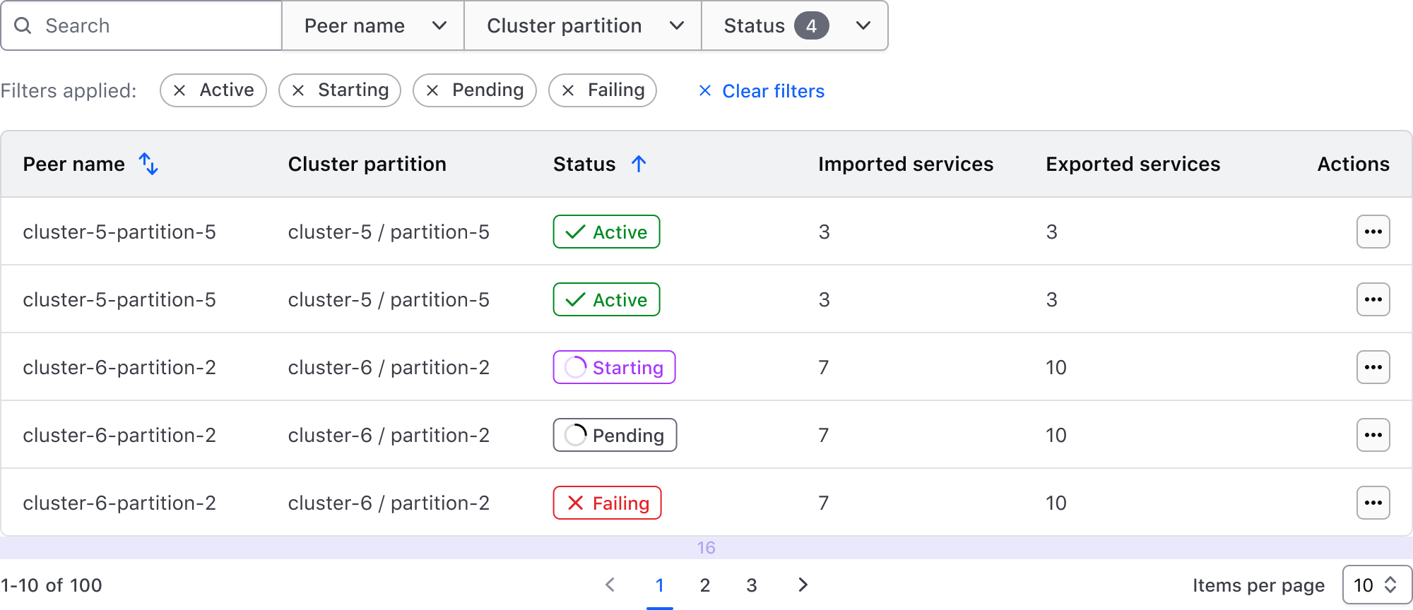
Filtering consists of several conceptual foundations that contribute to the larger pattern, filtering method, and communication of filters to the user.
Concepts and terminology
| Concept | Usage |
|---|---|
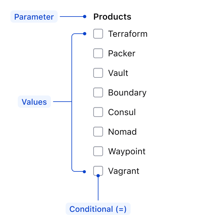
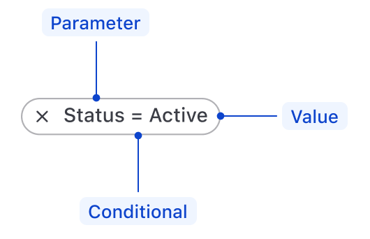
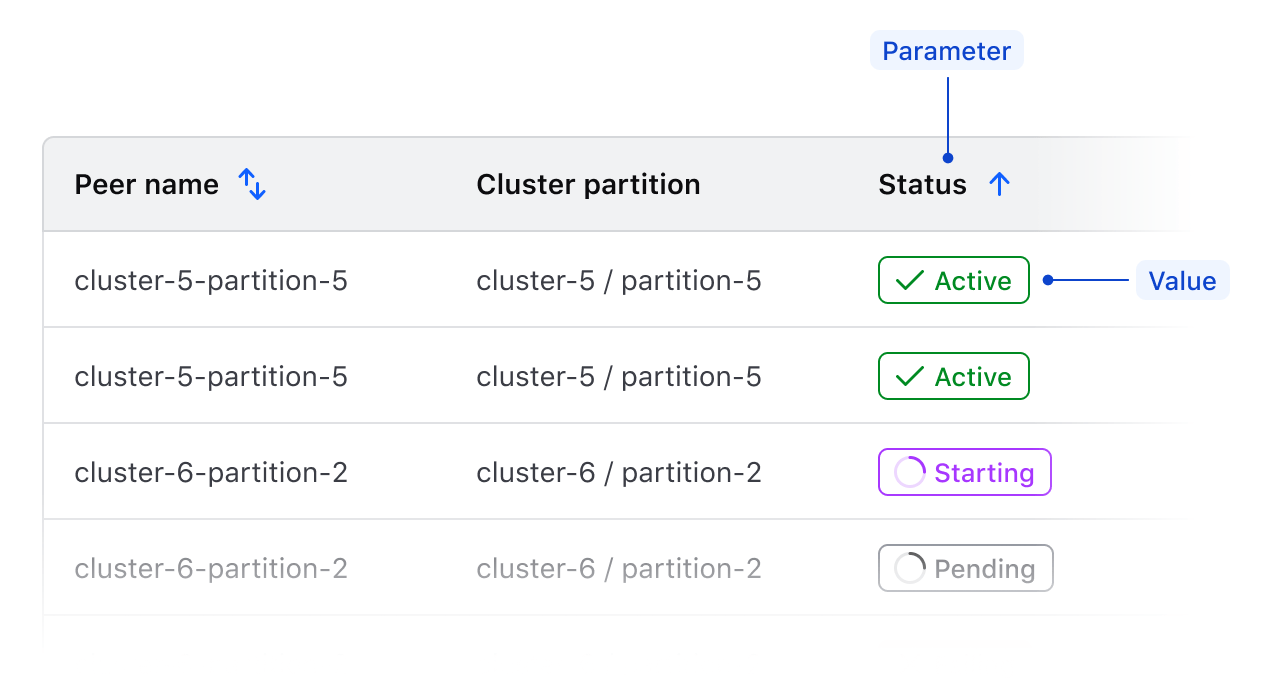
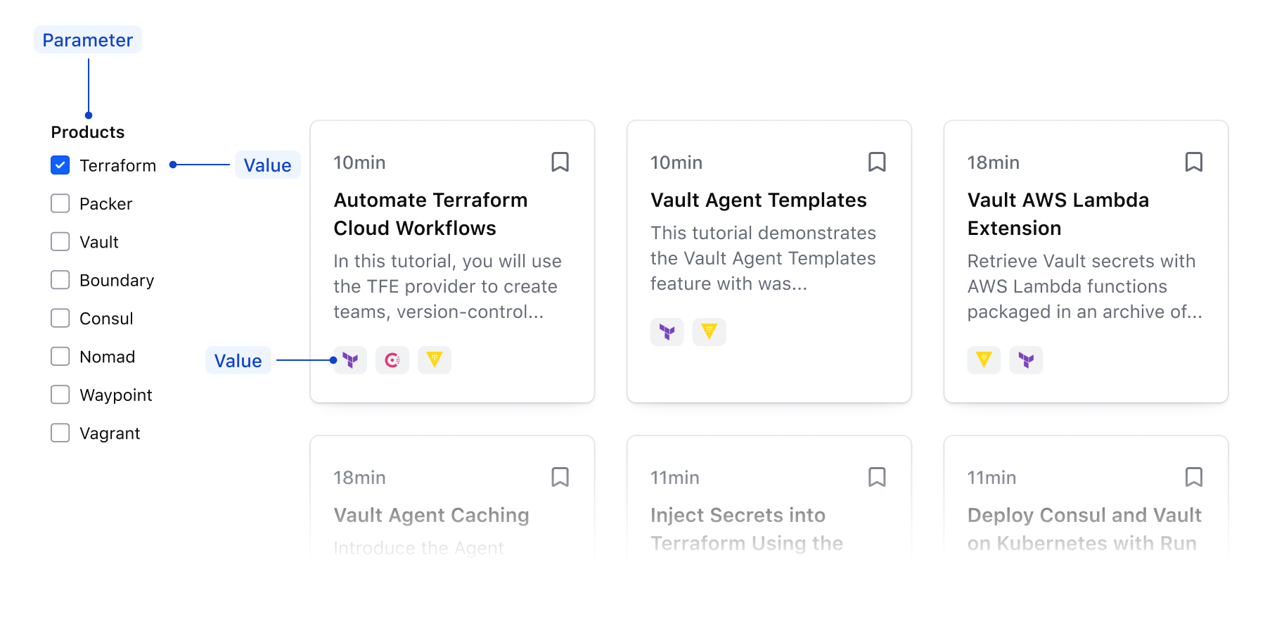
| Parameter | Refers to the specific property or category that is being filtered on; often represented by the specific label of the filter. |
| Value | Refers to the specific value within a parameter that is referenced in the filter; e.g., a specific string, status, numerical range, etc. |
| Conditional | Refers to the relationship between the parameter and the value. |
The combination of the parameter, conditional, and value results in a variable and determines the specific records being included or excluded from a data set.

In the context of a filter bar
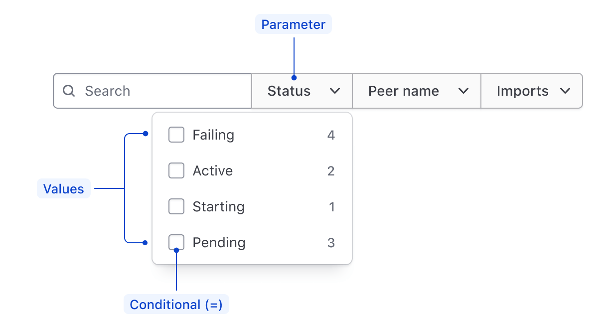
In the context of a filter sidebar
In the context of an applied filter
Conditionals
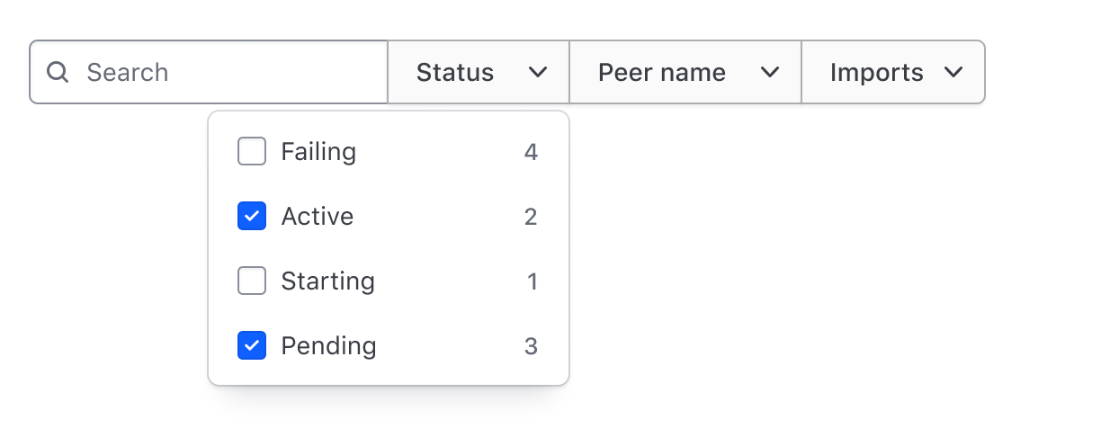
Conditionals express the relationship between a parameter and value, the most common being the equality conditional which signifies a parameter is equal to a value or array of values.
This example showcases an equality filter that would return records in a data set where the Status parameter is equal to values Active and Pending.
Other types of conditionals can be used to account for different value types (booleans, strings, ranges, etc). Which conditional to use depends on the type of parameter and the values it contains.
Comparative conditionals
- Equals (
=) - Does not equal (
≠) - Greater than (
>) - Less than (
<) - Greater than or equal to (
≥) - Less than or equal to (
≤)
Text and string conditionals
- Contains
- Does not contain
- Starts with
- Ends with
Applied filters in context
The variable determined by the combination of the parameter, conditional, and value should be communicated by the content within the tag. How explicit this communication is depends on the level of complexity, but more explicitness often benefits the user, especially when parameters might have similar labels and associated values.
Explicit communication of an applied filter

Implied communication of an applied filter

Mirroring of parameters
Filterable parameters should mirror the columns in a table or other visible label in the data set. This is the most explicit method to communicate what parameters are available to filter on and how the results within a data set change based on the applied variables.
Mirroring parameters in a filter bar
This example showcases a 1:1 relationship between the columns of a data set and the available filter parameters in the filter bar.
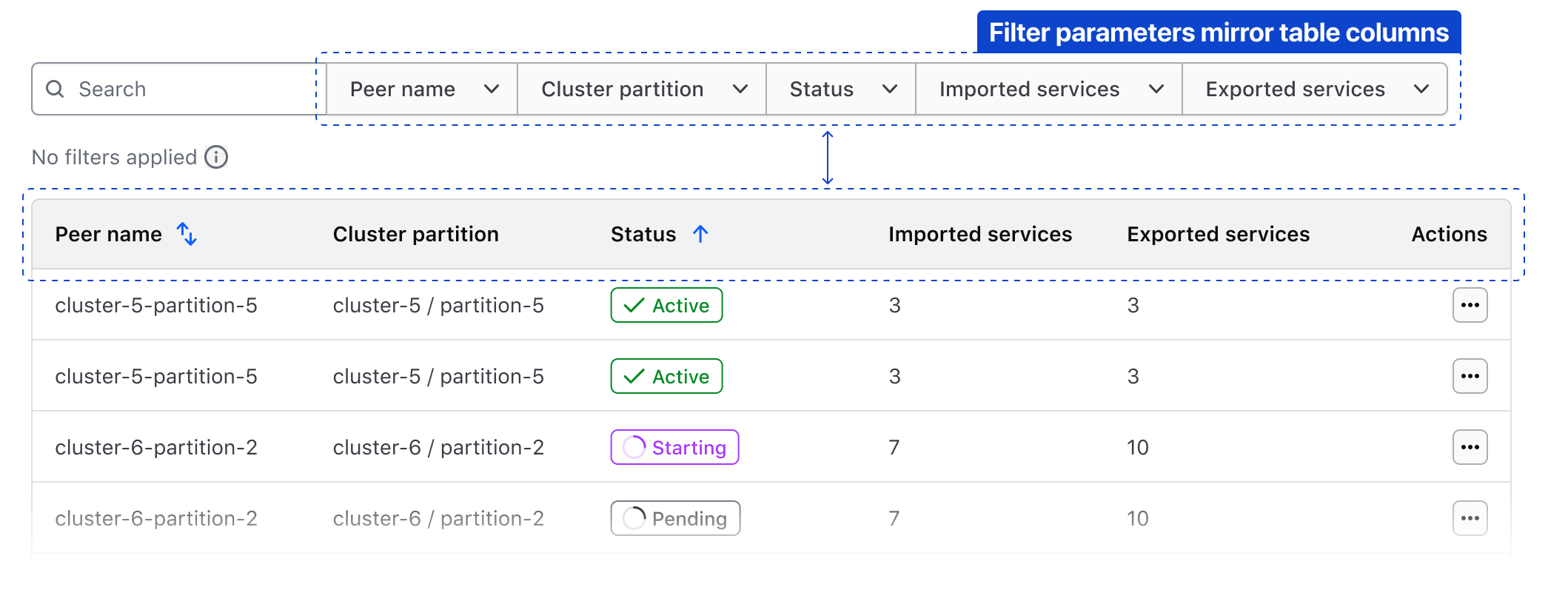
It's not always necessary to mirror all of the parameters in a data set, there may be parameters that aren't relevant to filter upon.
Dont include a parameter in the available filters that is not visually reflected in the data set.
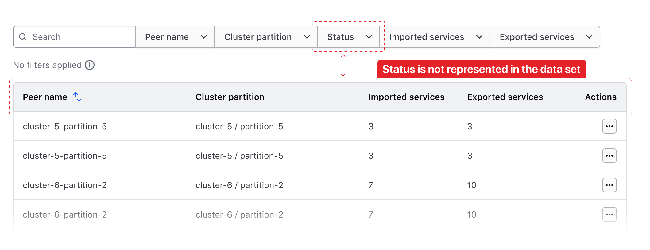
Filtering on an unrepresented parameter will return results that correspond with the filter, but the specific value is not displayed to the user and corresponding result.
Related
-

Dropdown
Hide/Show a list of actions or options with a toggle button.
-
Pagination
Used to let users navigate through content broken down into pages.
-

Segmented Group
Combines one or more input fields and actions to handle complex filtering and data collection.
-

Table Multi-select
Guidelines, compositions, and interaction patterns for selecting and transforming results in a Table.